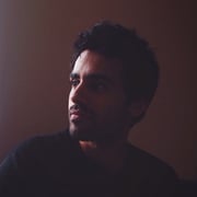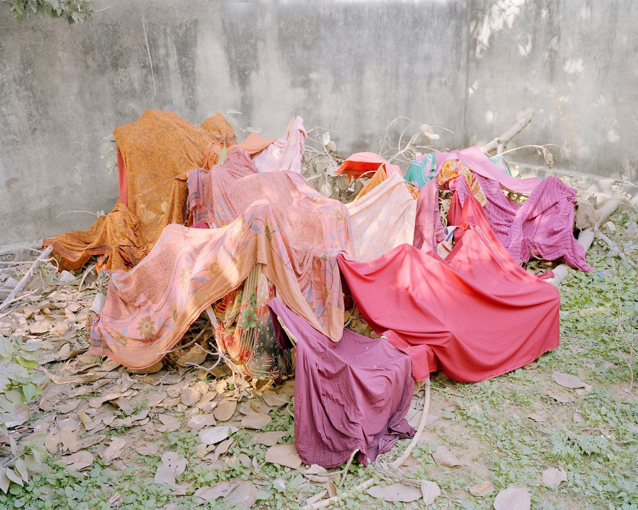
The array of sherbet-colored photographs from Vasantha Yogananthan’s The Myth of Two Souls conjure a delicious state of uncertainty. It’s hard to determine what is illustrated, embellished, or collaged, and what is documentary or staged. An image of an isolated musical instrument reminds us to engage more senses. Listening with the eyes, another string emerges: in this story realism is overrated. Classical perspectives are disrupted with fog and other elements that obscure focal points and horizons.
Known for his photobooks, Yogananthan’s seven year project is currently on view as part of the exhibition Turning the Page at Pier 24 in San Francisco. Exploring the role of the landscape and the characters of the ancient Hindu epic the Ramayana, the legend has real geographical counterpoints in India, where the mythical characters cross India to Tamil Nadu on a bridge built by Rama’s army over the ocean to Sri Lanka. Collaborating with skilled traditional artists who paint on the photographs, adding subtle colors that are barely discernible, or delicate patterns, he weaves an expansive tapestry of gestures echoing across time and space. The delicate tones of the transitional time of dawn or twilight and their unearthly pinks—also found in traditional art of the Ramayana—are on repeat.
Yogananthan’s practice seems to make the old new again through tactile interventions—a welcome antidote to the numbness of AI that celebrates the handmade and the personal, engages with the past and reaches into the future. In this interview for LensCulture, he speaks to Rebecca Horne about his love for painting, the merits of the color pink and his recent experience showing his work in exhibition form.

Rebecca Horne: How do you begin your projects?
Vasantha Yogananthan: I start with an intuition of vaguely what it is that I am looking for. Most of the time, I never end up making these pictures. That’s the most wonderful experience about photography. John Gossage said something along these lines: ‘I go to places, and I hope that these places will teach me something.’ I think that resonates. Places are inhabited by people and you engage in a human experience—one that can be very deep at times. The experience should guide the work.
It’s a very subjective point of view—but the few times I set out to make a photograph thinking of a clear concept, I have the feeling that I was trying to illustrate the idea I had prior to my travels. And it felt kind of wrong, because then it is about the photographer, in the real world, trying to illustrate preconceived ideas. I think that can be quite dangerous. So I always try to reverse things. It’s hard because it makes you fail quite a lot. You take wrong directions if what you’re looking for is unclear.

RH: How did this approach develop into The Myth of Two Souls?
VY: I enjoy working over several years. This project happened over 14 different trips and eight or nine years of traveling. I think the resulting photographs possess that quality of time passing. For example, the picture where the perspective is hidden by smoke was from when I took the first trip for the project in 2013. It was a complete disaster. I was really lost. I was very young. I think I traveled for five weeks, came back to France and looked at the contact sheets—because I work in analog so I was not looking at what I was making whilst traveling—and out of all of the pictures I made for months, this was the only good photograph.
But the trip was not wasted. Because, sometimes, there is that one picture that you feel might be the start of something. What am I seeing that is not there in the hundreds of other photographs that I’ve made? This was quite a pivotal picture for me.

RH: You use compositional strategies that disrupt traditional perspective—and one of the things I noticed that you’ve been using to obscure the horizon is fog and vapor. Can you talk about that?
VY: I think that one of the greatest strengths of photography as a medium is its ambiguity and you can play with that on so many levels. Many people compare painting to photography, saying that photography will never be as strong as painting because it lacks texture and it has no surface. But the flatness of photography also creates an illusion. It can be a tool to work with.
The work that happens in the studio is as important for me as the making of the picture out in the real world. And because photographs are really raw materials, they can become anything in a book or on the wall. The way you play with them, in terms of scale and layout, can really deviate the way people will engage with them.

One of the first trips I did in India was in the north during winter. It’s actually quite cold at that time, and with the pollution, a kind of fog spreads all over the landscape. The fog would last from 6am in the morning until 11am, so there was four or five hours where the landscape was covered and revealed at the same time, as it rolled in and out. The color of the fog itself was changing: you would experience that very surreal feeling as it changed from deep blue to light blue to bluish pink to pinky yellow to yellow orange.
RH: Can we talk about all that pink for a minute? What’s going on there?
VY: I’m self-taught and never went to any art schools, but my main love is painting. So I look more at paintings than I do photographs. Painters often have a favorite color. For me, pink, especially in India, is a color with so many meanings: lushness, brightness, warmth and comfort. In the West, pink is a color that’s is underrated; it is always for kids or girls. There are many preconceived ideas we have about pink. But pink can be anything—from a bluish thing to very warm to very yellowish. It became a recurring color in the work.
It’s funny and slightly weird because black and white photography makes you read images in a certain way. I feel there is less thinking about the way colors affect and shift the way we read photographs. But they are key. They are as important for me when I make a picture as the composition, lighting or the framing of the content itself. In fact, one of the first things I try to understand when I start a new body of work is: what is the color palette going to be? And it can be very restricted.

RH: The work has a quality of flatness. I feel like there is a dialog going on between illustration and photography and painting and traditional arts.
VY: I just saw an amazing exhibition by Pierre Bonnard, one of France’s most famous painters. He was heavily influenced by Japanese paintings. Around a century ago, these painters came to redefine the entire medium and they were looking at a lot of stuff coming from Japan or China, where flatness was the rule. The rules of perspectives were not the same as in the West.
When I was traveling in India, I was looking at a lot of Indian arts. Growing up in the West, I mainly had access to European paintings. So when I started the project, I became more and more interested in other forms of art, like illustration and paintings. I guess the things that you’re looking at as an artist, even if it’s unconscious, inform the way you look at the world and the way you think of your own work. And if you’re trying to move forward in your practice, step by step, you’re trying to digest diverse influences and to find your inner voice.

RH: Can you talk a little bit about subtlety and how that plays out in your work?
VY: I’m 39. I’ve been making pictures for 20 years now, and professionally, for a little more than 12 or 13 years. It feels like a long time, and it also feels very fresh; I still feel like I’m a beginner somehow. As I work, as an artist and as a human being, I’m less and less interested in photographs where I can understand what the content is and what it is trying to teach me. I’m very much drawn to a body of work where things are very open.
Our medium lacks sound, it lacks movement, it lacks continuity, and therefore it leaves space for the viewer’s imagination to wander. For me, sequencing photographs is a key part of the way I understand the layered possibilities embedded within the medium. As soon as you start combining things together, if you do it right, you can really add depth and meaning, and therefore more questions and more openness to the work. Even though the project itself is linked to a story that has a beginning, a middle, and an ending, I wanted the exhibition, the books and the project to be very loosely related to the story. It’s like the photographs are echoes or musical notes.

RH: I’m glad you said that, because there’s a photograph of an illustration of a musical instrument in the show. And there are other images where I felt you were telling the viewer to use all of their senses when approaching the work. It’s not enough just to be looking.
VY: Yeah. In India, the Ramayana is also called the first poem because it wasn’t written in paragraphs but in verse. Singers and musicians would travel from village to village, and they would sing it in front of a live audience. That image of a musical instrument is on the last wall of the exhibition, but it can also be read as the first. So it’s an in-between connection.

RH: How long does the editing process take you?
VY: For Pier 24, we were working on the room for a whole year. Allie Haeusslein from Pier 24 was my partner in editing and sequencing. It was the first time I had three full days to hang an exhibition. When you come into the space it’s so different from the 3D mock ups—we ended up changing maybe 50% of the planned layout.
I really enjoyed the almost performative experience of sitting in the space for three days, and all the works are on the floor and you’re trying to think of the exhibition as something that can be engaging for the viewer. You want them to move across the space, to come closer and to take a step back. I really like this process.

RH: Would you tell me a little bit about your current show in Arles?
VY: So many challenges come at you when you walk into a space that’s a 12th century old church in the south of France where you can’t light the works. There are no lights, just the light coming from the windows. I think it’s one of my most successful exhibitions layout-wise, because the work was meant to be shown in that specific space.
It’s a new body of work I made in the south of France, very much rooted in the history of the region although it has no clear subject. If I had to say what it was about, I’d say the passing of time. So it’s very loose. Memory and the passing of time. I think actually, this year, between the Pier 24 exhibition and this one in Arles, I think these two shows have been key for me in my understanding of what exhibitions can do.

RH: Tell me more about that realization.
VY: For the first ten years of my practice, I was first and foremost a bookmaker, because I was a young photographer, self-taught. No galleries behind me, no exhibitions offered to me. So books were the natural space to make my work and to disseminate it to an audience.
I would like to move towards making exhibitions that feel more installation-based, and taking a step further, I would like to try to show photography in a new way—not as it has been done for so many decades. Even if a photograph is a two-dimensional object, and if we circle back to the start of the conversation, it has a flatness to it, it is not a sculpture. It’s different. But I think that there are plenty of possibilities to work with, exhibition-wise. So I’m quite excited. If I get the chance to have some more shows like this, this is what I’ll explore for the next few years. Also, to come back to making books maybe in two or three years with renewed and fresh energy. I did nine books in ten years and what I fear most as an artist is to repeat a formula and to repeat myself.
Editor’s note: Turning the Page is on view at Pier 24, San Francisco, until January 31 2025, and Time Frames is on view at Rencontres d’Arles until September 29, 2024.